Org Card
Add a group of cards, each card contains a heading, icon and optional content. Adjacent Org Cards are grouped together, each Org Card is a separate piece of content.
Content Type Details
- ID: 463
- Name: Dallas - Org Card
- Minimum user level: Contributor
- Use with page layouts: Full Width, Page with Sidebar - in Main Body, Microsite, PPC Campaign - in Main Body, PPC Campaign - in Full Width
Content Type Elements Details
| Name | Description | Size | Type | Required | Conditionally Shown |
|---|---|---|---|---|---|
| Name | The Name Element | 80 Characters | Plain Text | Yes | No |
| Content Group Heading | Enter an optional heading above the group of cards. Set on the first card in a group. Adding a heading will start a new group. | 255 Characters | Plain Text | No | No |
| Content Group Heading Level | Set the level of optional heading above the group of cards Choose from options: Heading 2, Heading 3, Heading 4, Heading 5, Heading 6 | N/A | Select Box (List: Dallas - Headings) | Yes | Yes |
| Content Group Description | Enter optional text above the group of cards. Set on the first card in a group. See TinyMCE content options. | 9999 Characters | HTML | No | Yes |
| Header Only | To remove the body of the card and display the header only, check yes. Choose from options: Yes | N/A | Check Box (List: Dallas - Yes - unchecked) | No | No |
| Items Per Row | Select how many items should appear on a single row (1, 2, 3, 4). The cards will display at 25% on medium screens or higher by default. Choose from options: 1, 2, 3, 4 | N/A | Select Box (List: Dallas - Items Per Row) | No | No |
| Bypass Chevrons | Check to bypass the default chevron behavior on bulleted links Choose from options: Yes | N/A | Check Box (List: Dallas - Yes - unchecked) | No | No |
| Card Title | Enter text for the heading. | 255 Characters | Plain Text | Yes | No |
| Card Title Link Type | Select internal or external for the card title Choose from options: Internal, External | N/A | Select Box (List: Dallas - Link Type) | No | No |
| Card Title Link | Select the internal link | N/A | Section/Content Link | No | Yes |
| Card Title External Link | Enter full URL (including https://) for external link | 300 Characters | Plain Text | No | Yes |
| Card Title Heading Level | Enter the heading size Choose from options: Heading 2, Heading 3, Heading 4, Heading 5, Heading 6 | N/A | Select Box (List: Dallas - Headings) | Yes | No |
| Card Header Color | Choose color for the top of card Choose from options such as: Blue, Red, Dark Grey, Light Blue, Dark Blue | N/A | Select Box (List: Dallas - Org Card Color) | Yes | No |
| Card Icon | Select the icon for the header Choose from options such as: Address Book, Align Center, Apple, Apple Alt, Archway | N/A | Select Box (List: Dallas - Icons) | No | No |
| Card Center Align Content | By default the Card Body and CTA Button are left aligned, check to align center Choose from options: Yes | N/A | Check Box (List: Dallas - Yes - unchecked) | No | Yes |
| Card Body | Enter the content for the card body, this can contain text and links. When adding a list of links these will automatically pick up the action link style on the page. Please note that not all TinyMCE content options are suitable for use here. | 99999 Characters | HTML | Yes | Yes |
| CTA Button Text | Enter text for CTA button | 255 Characters | Plain Text | No | Yes |
| CTA Button Color | Select CTA Button Color Choose from options such as: Blue, Red, Grey, Light Blue, Light Red | N/A | Select Box (List: Dallas - Button Colors) | No | Yes |
| CTA Button Link Type | Select link type Choose from options: Internal, External | N/A | Select Box (List: Dallas - Link Type) | No | Yes |
| CTA Button Link Internal | Select section/content for internal link | N/A | Section/Content Link | No | Yes |
| CTA Button Link External | Enter full URL (including https://) for external link | 255 Characters | Plain Text | No | Yes |
| Content Group Footer | Enter optional text below the group of cards. Set on the last card in a group. See TinyMCE content options. | 9999 Characters | HTML | No | No |
Examples
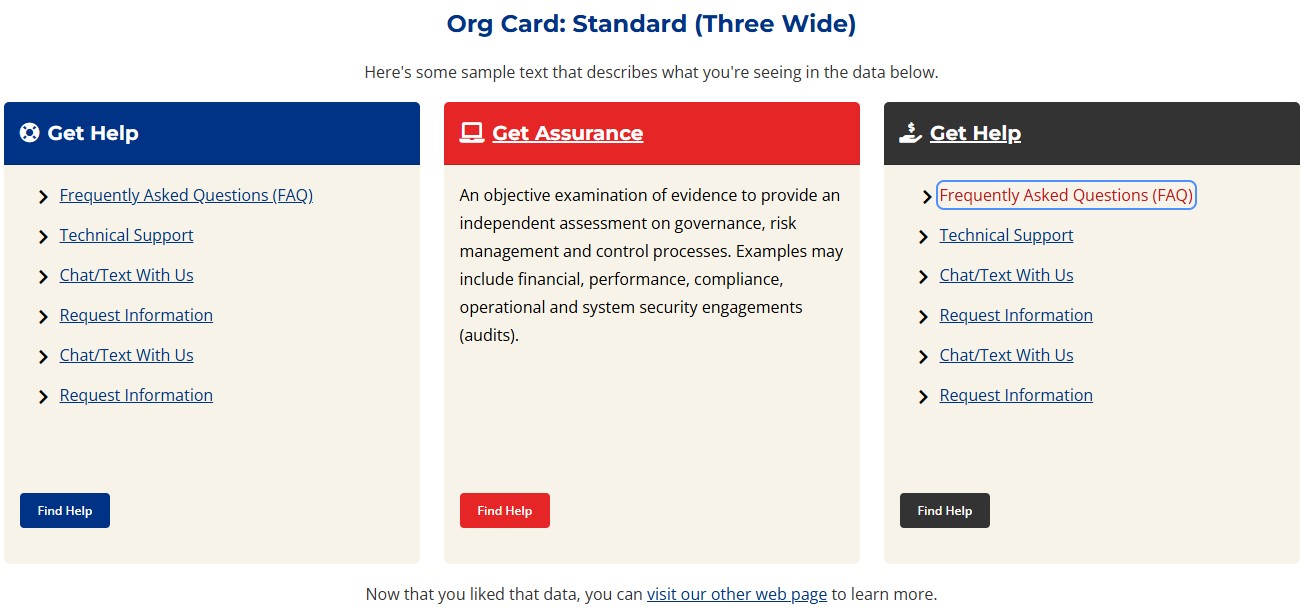
Org Card: Standard (Three Wide)
Here's some sample text that describes what you're seeing in the data below.
Get Assurance
An objective examination of evidence to provide an independent assessment on governance, risk management and control processes. Examples may include financial, performance, compliance, operational and system security engagements (audits).
Now that you liked that data, you can visit our other web page to learn more.
Org Card: Standard (Two Wide)
Here's some sample text that describes what you're seeing in the data below.
Get Help
Walk-ins are welcome!
Current students can schedule an appointment using Navigate.
Get Help
Walk-ins are welcome!
Get Help
Walk-ins are welcome!
Now that you liked that data, you can visit our other web page to learn more.
Org Card: Heading Link Only
Here's some sample text that describes what you're seeing in the data below.