Feature Card
Add a group of Feature Cards. Each card can contain an image or icon, text and has multiple display options. Adjacent Feature Cards are grouped together and styled the same, colors can vary. Each Feature Card is a separate piece of content.
Content Type Details
- ID: 469
- Name: Dallas - Feature Card
- Minimum user level: Contributor
- Use with page layouts: Full Width, Page with Sidebar - in Main Body, Microsite, PPC Campaign - in Main Body, PPC Campaign - in Full Width
Content Type Elements Details
| Name | Description | Size | Type | Required | Conditionally Shown |
|---|---|---|---|---|---|
| Name | The Name Element | 80 Characters | Plain Text | Yes | No |
| Content Group Heading | Enter an optional heading above the group of cards. Set on the first card in a group. Adding a heading will start a new group. | 255 Characters | Plain Text | No | No |
| Content Group Heading Level | Set the level of optional heading above the group of cards Choose from options: Heading 2, Heading 3, Heading 4, Heading 5, Heading 6 | N/A | Select Box (List: Dallas - Headings) | Yes | Yes |
| Content Group Description | Enter optional text above the group of cards. Set on the first card in a group. See TinyMCE content options. | 9999 Characters | HTML | No | Yes |
| Items Per Row | Select how many items should appear on a single row (2, 3, 4). The cards will display at 25% on medium screens or higher by default. Choose from options: 1, 2, 3, 4 | N/A | Select Box (List: Dallas - Items Per Row) | No | No |
| Card Style | Choose the card style for the group. Set on the first card in a group, the style is taken from the first card in a group to ensure all are the same style. Set on each card to show the right elements. Choose from options: Solid with link, Icon, Image | N/A | Select Box (List: Dallas - Feature Card Style) | Yes | No |
| Card Background | Choose a background color for the card Choose from options: White, Light Grey, Light Blue, Blue, Red | N/A | Select Box (List: Dallas - Feature Card - Card Colors) | Yes | No |
| Title | Enter a title | 80 Characters | Plain Text | No | No |
| Title Heading Level | Select heading level Choose from options: Heading 2, Heading 3, Heading 4, Heading 5, Heading 6 | N/A | Select Box (List: Dallas - Headings) | No | No |
| Title Link Type | Select link type Choose from options: Internal, External | N/A | Select Box (List: Dallas - Link Type) | No | No |
| Title Link Internal | Select section/content for internal link | N/A | Section/Content Link | Yes | Yes |
| Title Link External | Enter full URL (including https://) for external link | 255 Characters | Plain Text | Yes | Yes |
| Icon | Choose an Icon Choose from options such as: Address Book, Align Center, Apple, Apple Alt, Archway | N/A | Select Box (List: Dallas - Icons) | No | Yes |
| Icon Background Color | Choose a background color for the icons Choose from options such as: Blue, Dark Blue, Red, Dark Red, Dark grey | N/A | Select Box (List: Dallas - Feature Card - Icon Colors) | No | Yes |
| Icon Background Shape | Choose a background shape for all icons in the group of cards. Set this on the first card in the group. Choose from options: None, Circle, Square, Block | N/A | Select Box (List: Dallas - Feature Card - Icon Shapes) | No | Yes |
| Image | Select a suitable image from the Media Library | N/A | Media | Yes | Yes |
| Large Image | Check to display the image larger image for all cards in a group. Set on the first card in a group Choose from options: Yes | N/A | Check Box (List: Dallas - Yes - unchecked) | No | Yes |
| Image Circle | By default Image is square, check to change to a circle for all cards in a group. Set this on the first card in the group. Choose from options: Yes | N/A | Select Box (List: Dallas - Yes - unchecked) | No | Yes |
| Card Text | Enter the Card Text, this can contain text and links. Please note that not all TinyMCE content options are suitable for use here. | 2000 Characters | HTML | No | No |
| Content Group Footer | Enter optional text below the group of cards. Set on the last card in a group. See TinyMCE content options. | 9999 Characters | HTML | No | No |
Examples
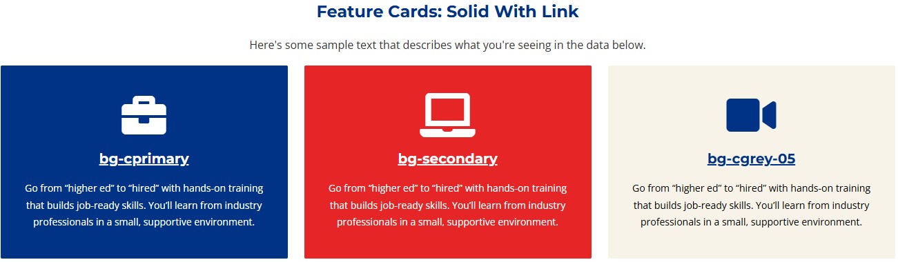
Feature Cards: Solid With Link
Here's some sample text that describes what you're seeing in the data below.
bg-cprimary
Go from “higher ed” to “hired” with hands-on training that builds job-ready skills. You’ll learn from industry professionals in a small, supportive environment.
bg-secondary
Go from “higher ed” to “hired” with hands-on training that builds job-ready skills. You’ll learn from industry professionals in a small, supportive environment.
bg-cgrey-05
Go from “higher ed” to “hired” with hands-on training that builds job-ready skills. You’ll learn from industry professionals in a small, supportive environment.
Feature Card: Icon in Circle
Here's some sample text that describes what you're seeing in the data below.
Title
Spend less time ... completely online.
Title
Spend less time ... completely online.
Title
Spend less time ... completely online.
Title
Spend less time ... completely online.
Title
Spend less time ... completely online.
Title
Spend less time ... completely online.
Now that you liked that data, you can visit our other web page to learn more.
Feature Card: Icon in Square
Here's some sample text that describes what you're seeing in the data below.
Title
Spend less time ... completely online.
Title
Spend less time ... completely online.
Title
Spend less time ... completely online.
Title
Spend less time ... completely online.
Title
Spend less time ... completely online.
Title
Spend less time ... completely online.
Now that you liked that data, you can visit our other web page to learn more.
Feature Card: Icon in Full Block
Here's some sample text that describes what you're seeing in the data below.
Training Close to Home
Spend less time ... completely online.
Training Close to Home
Spend less time ... completely online.
Training Close to Home
Spend less time ... completely online.
Feature Card: Image in Square
Here's some sample text that describes what you're seeing in the data below.

Training Close to Home
Spend less time ... completely online.
Training Close to Home
Spend less time ... completely online.
Training Close to Home
Spend less time ... completely online.
Feature Card: Image Large in Square
Here's some sample text that describes what you're seeing in the data below.
Training Close to Home
Spend less time ... completely online.
Training Close to Home
Spend less time ... completely online.
Training Close to Home
Spend less time ... completely online.
Feature Card: Image in Circle
Here's some sample text that describes what you're seeing in the data below.
Training Close to Home
Spend less time ... completely online.
Training Close to Home
Spend less time ... completely online.
Training Close to Home
Spend less time ... completely online.
Feature Card: Image Large in Circle
Here's some sample text that describes what you're seeing in the data below.
Training Close to Home
Spend less time ... completely online.
Training Close to Home
Spend less time ... completely online.
Training Close to Home
Spend less time ... completely online.