Button Advanced
Add a Button with more advanced options than adding a button to a WYSIWYG including icons, more colors etc. Adjacent Button Advanced content items show side-by-side.
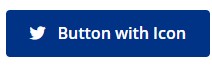
Screenshot showing example of Button Advanced content type.
Content Type Details
- ID: 473
- Name: Dallas - Button Advanced
- Minimum user level: Contributor
- Use with page layouts: Full Width, Page with Sidebar - in Main Body, Microsite, PPC Campaign - in Main Body, PPC Campaign - in Full Width
Content Type Elements Details
| Name | Description | Size | Type | Required | Conditionally Shown |
|---|---|---|---|---|---|
| Name | The Name Element | 80 Characters | Plain Text | Yes | No |
| Button Text | Enter the text to display on the button | 255 Characters | Plain Text | Yes | No |
| Button Link Type | Select link type Choose from options: Internal, External | N/A | Select Box (List: Dallas - Link Type) | Yes | No |
| Button Link Internal | Select section/content for internal link | N/A | Section/Content Link | Yes | Yes |
| Button Link External | Enter full URL (including https://) for external link | 255 Characters | Plain Text | Yes | Yes |
| Align Center | Check to align the button to the center of the container Choose from options: Yes | N/A | Check Box (List: Dallas - Yes - unchecked) | No | No |
| Margins | Select the margins for the top and bottom of the column. If no selection is made, the default top and bottom margins will be my-3. Choose from options such as: No Margin, .25 rem (my-1), .5 rem (my-2), 1 rem (my-3), 1.5 rem (my-4) | N/A | Select Box (List: Dallas - my Margins) | No | No |
| Button Color | Choose a color Choose from options such as: Blue, Red, Grey, Light Blue, Light Red | N/A | Select Box (List: Dallas - Button Colors) | Yes | No |
| Button Icon | Choose an icon to display on this button Choose from options such as: Address Book, Align Center, Apple, Apple Alt, Archway | N/A | Select Box (List: Dallas - Icons) | No | No |
| Icon on Right | By default an icon displays on the left side of the button, check to change to the right Choose from options: Yes | N/A | Check Box (List: Dallas - Yes - unchecked) | No | Yes |
| Button Size | Choose the size Choose from options: Standard Button , Extra Large Button, Large Button, Small Button, Mini Button | N/A | Select Box (List: Dallas - Button Size) | No | No |
| Block button | Check for the button to display block and fill the horizontal space Choose from options: Yes | N/A | Check Box (List: Dallas - Yes - unchecked) | No | No |
Groups and TinyMCE
To add a group of buttons in a list style format use the Button Group content type. A standard set of Buttons can also be added in any TinyMCE element, with some color and size options see Buttons TinyMCE Guidance.